National Law Enforcement Museum
My Role: Lead User Experience Researcher and Designer
Objective / the ask: To create a visually appealing, usable, accessible and responsive website for all, that communicates the Museum’s mission, those it serves, a history of Law Enforcement, and the latest efforts to bridge gaps and heal wounds between police and communities across the U.S., from a national and law enforcement perspective.
Leading competitive analysis, interviews, attending “in-the-shoes” experiences
During our first phase of work on the museum site, we extensively reviewed the flow and information architecture of competing museum sites - and then presented findings to our clients.
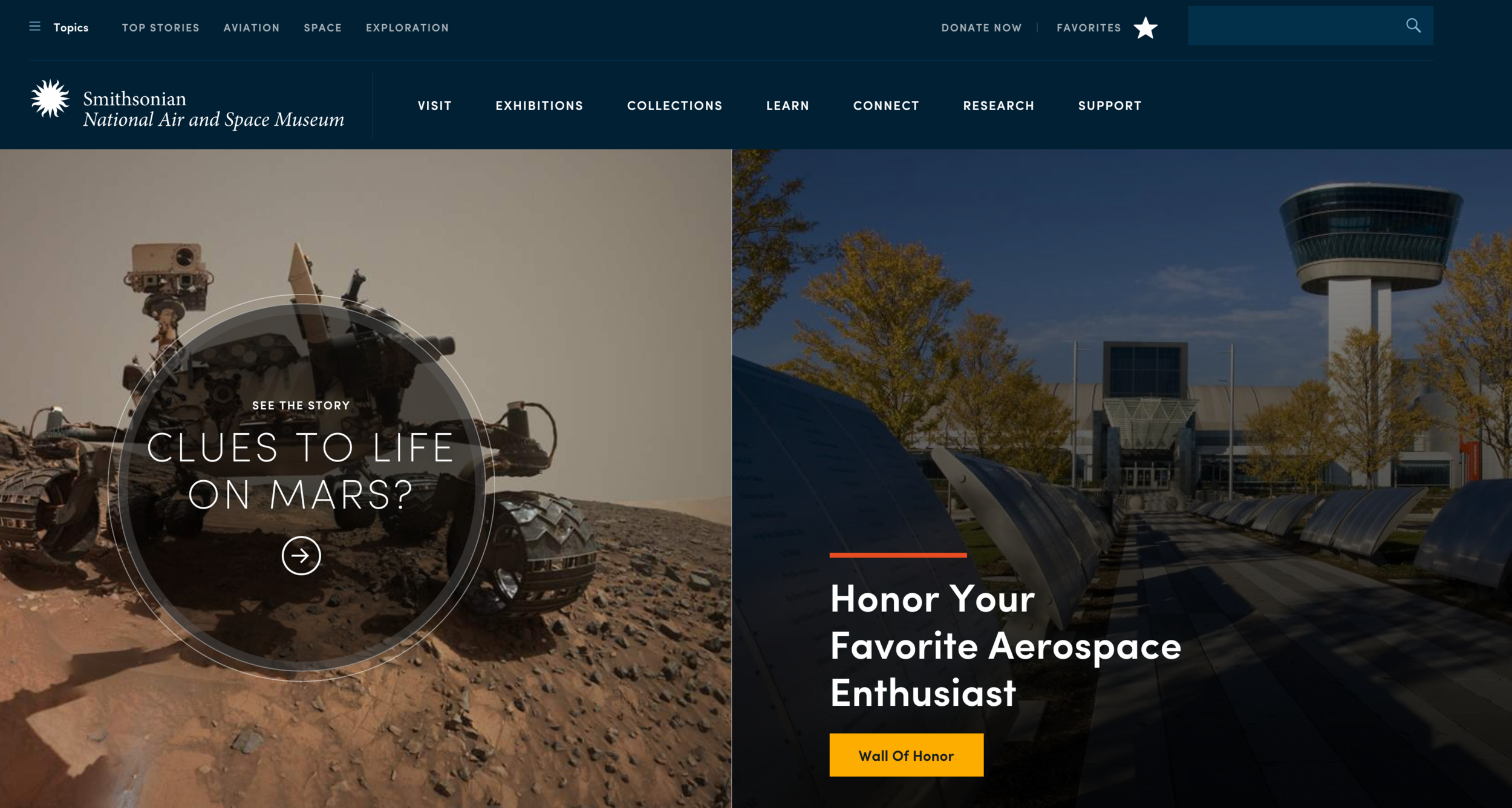
Compared navigation experience, menu design patterns, footer patterns, and overall layout of innovative and successful museum websites
We learned how and where ticketing, timing, event scheduling and donations or other good causes are handled in popular competing websites.
Reviewed and discovered interactive features of other museums to draw in users, which informed a continuously playing “sizzle reel” of what it is like to attend and walk through the museum - found in the current website.
Attended and experienced in-person live-fire and digital police self-defense/situational shoot simulations, to understand our client’s perspective, as well as our users in-museum experiences to come - which would feed into our journey mapping and website.
Researching and mapping out the customer journey and personas
I worked closely with our marketing strategy team to conducted extensive research, and perform interviews with potential user types, the client, and surveys to figure out who would be attending the museum and when.
We interviewed over 12 business, technical and museum content stakeholders, to understand and make sense of the requirements, needs, hopes and goals for the museum and the new website from multiple perspectives.
We developed 8 main user perspectives, which I then distilled into these 8 different color keyed customer journey maps (designed in Sketch).
These customer journey maps revealed opportunities for service design improvement, places where the museum can find its “blind spots” with regard to the different mindsets of potential customers.
We encouraged our clients to consider communities of color, women, and historically marginalized communities through the process, to help facilitate understanding and empathy between police and the communities they serve.
Information Architecture
Sketching
Conducted and facilitated design studios, and “design jams” for our teams to rapidly get ideas down onto paper.
Quickly sketched a number of options that would meet with our proposed information architecture - Home, About, Learn/Education, Programs, Events, Contact, Ticketing, Donation and Announcements.
Led “guerrilla testing” of layouts and sketches on potential museum guests, friends, people at Starbucks, and of course, our clients (having redacted anything confidential).
Used lowest fidelity deliverables to discover team “blind spots”, architecture, see how page items relate, confirm hierarchy of elements, and generally start confirming ideas for design patterns.
Creating concept wireframes and prototyping
After sketching up the layouts, validating them with users and our client, incorporating user feedback, and matching pages up to our MVP information architecture, I jumped into Adobe Xd and created grayscale images for the major pages. This was presented to the client in clickable format, along with customer journeys.
Next up (second and third rows to the left), I created higher and higher fidelity pages.
Working with development and visual designer teams, we then created both a bootstrap coded prototype, and photoshop high fidelity mockups, with photo treatments and UI kit applied - in order to have better and better fidelity layouts and prototypes to test with.
I printed out all pages and flows of our prototypes, put them on the wall for clients and team members feedback sticky notes, and make sure everyone was in alignment (below).
User and team feedback, design progress visibility and user task analysis (ribbons)
Key results: A well researched and designed museum site design that communicates the brand and museum experience dynamically, effectively, and while supporting better police-public relationships.
Outputs to the right, were the final mockups from our combined visual and experience design efforts to make one complete, high fidelity product, that was a great experience.
We designed, developed and tested this website with deep involvement in everything from the stakeholders and building itself to the users and police officers in the field.
Despite the ongoing political sensitivities, injustices, and difficulties inherent with law enforcement, race and community connections, I feel that it was a triumph to combine a real “police” vibe with care for our communities, modern design, appreciation of history, and most importantly, a website that is usable on any device, that allows users to truly understand “what’s in the museum”.
The end result is one I’m very proud of: A product that helps human beings, is beautiful, makes sense, and just works.
https://lawenforcementmuseum.org


